WETU
Project Manager
Developer
Smart Travel Companion: TravelKey
Travellers need quick, reliable access to their trip details - often while offline and under time pressure. The existing apps were fragmented, inconsistent, and inaccessible, resulting in confusion and missed information. The goal was to unify the experience into a single, modern app that worked offline, supported accessibility, and provided travellers with everything they needed in one intuitive place.
Timeline: 2019 - 2020
Designer
Platform: App
Role: UX/UI
Tester
Context & Constraints
Context
-
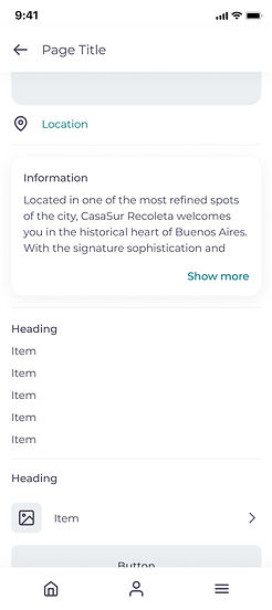
Mobile app providing travellers with access to accommodation, transport, activities, vouchers, maps, and emergency contacts.
-
Previously split across two outdated native apps with inconsistent UX.
-
Redesign focused on unifying the experience, improving accessibility, and supporting offline use.
-
Migration to Flutter required rethinking UI patterns and component structure.
Goals
-
Research Flutter design principles to create compatible UI components.
-
Conduct user testing to identify traveller pain points.
-
Account for complex travel scenarios (multiple trips, time zones, itineraries).
-
Resolve known functional issues (weather not showing on Android, translation errors, unclear disabled itineraries).
-
Ensure offline access for all core features.
-
Introduce Dark Mode and theming to support client branding.
Constraints
-
Legacy codebase and migration to Flutter introduced new UI limitations.
-
Fixed timelines alongside technical refactoring.
-
Inconsistent layouts and excessive navigation steps in the existing app.
-
Text placed over images reduced readability.
-
Previous oversimplification caused user confusion.
-
Global user base required simplified, clear language.
-
Balancing offline functionality with data synchronisation and updates.
User & Insights
Travellers using the app to access essential trip information while on the move, including accommodation details, transport schedules, activities, vouchers, maps, and emergency contacts. Users relied on the app in high-stress, time-sensitive situations, often with limited connectivity and varying levels of technical confidence.


Disclaimer
The user images and personas shown are representations of the broader user group based on research insights. They are not real individuals, and any similarities to actual persons are purely coincidental.
Key User Needs
-
Fast access to trip information at any time.
-
Offline access to itineraries, maps, and key documents.
-
Clear visibility of dates, times, contact details, and reference numbers.
-
Easy access to vouchers and documents that need to be presented.
-
Simple sharing of itineraries with fellow travellers.
Key Insights
-
Users prioritised reliability over feature richness.
-
Offline access was critical, not a “nice to have”.
-
Older users struggled with gesture-based navigation.
-
Unclear hierarchy and labels caused hesitation and errors.
-
Clear language mattered more than visual minimalism.
User Persona

Accessibility Considerations
-
High-contrast colour combinations for readability.
-
Legible font sizes across devices and lighting conditions.
-
Reduced reliance on gestures and hidden interactions.
-
Clear affordances for tapping and navigation.
-
Plain language to support international users.
-
Dark Mode and custom theming for visual comfort.
Design Process
Task Flows
-
Core traveller journeys mapped and simplified.
-
Reduced navigation steps for critical actions.
-
Clear entry points for offline content.

Sketches
-
Early exploration of hierarchy and content grouping.
-
Focus on clarity over visual density.


Wireframes
-
Validated information architecture and key flows.
-
Tested offline scenarios and error states.


Final Designs
-
Unified Flutter-based UI system.
-
Improved readability and accessibility.
-
Consistent layouts and component usage.
-
Support for Dark Mode and client theming.


.jpg)


Reflection
What I Learned
-
Accessibility improvements have an immediate impact on usability.
-
Designing within Flutter’s component system improves dev handoff.
-
Prototyping and testing with diverse users (age, language, tech literacy) is critical.
-
Clear hierarchy and language reduce user anxiety in travel contexts.
-
Offline-first thinking changes design priorities significantly.